Sense Flip Clock & Weather
- 4.2
- Rating
- 10.00M
- Installs
- Free
- Price
 Analysis by App-foxy
I usually want a weather app to answer one question quickly: what should I expect when I step outside? Sense Flip Clock & Weather takes a slightly different route. It combines local and international forecasts with a large flip-clock style display, so it feels more like a home-screen instrument than a weather feed I open only when clouds appear. After using it as a daily glance tool, I found that its appeal depends on how much you value visual information at a glance.
This is a free weather app from MACHAPP Software Ltd, available for Everyone and compatible with Android 6.0 or later. It has been around since December 28, 2011, and the current version is 9.01.0. Its scale is easy to understand from the store presence: it has passed ten million installs, with an average rating of 4.2 from roughly one hundred fifty-six thousand ratings and about nine thousand reviews. Those numbers do not make it automatically right for everyone, but they do suggest that the clock-and-weather combination has found a substantial audience.
What to expect from the clock and forecast combination
The central idea is simple: put time and weather in the same visual space. Instead of opening a conventional forecast app and moving through separate screens, I can use the clock as the anchor and read the current conditions around it. That makes the app especially natural on a phone used as a bedside device, kitchen reference, desk display, or quick morning check.
You May Also Like

 Blood Strike: 2.5 Anniversary
Blood Strike’s Loadouts Turn Every Drop Into a Tactical Gamble
A close look at Blood Strike’s custom loadouts: how fast access to signature weapons reshapes its battle royale rhythm, rewards preparation, and narrows the gap between fights.

 Pandora - Music & Podcasts
Pandora’s Music Is Easy to Start, but Harder to Recover
Pandora’s strength is its low-effort path from a seed to a station. Its weak spot is how much confidence it asks you to place in connection, setup, and quiet recovery.

 8 Ball Pool
 Is Built on Rivalries, Rematches, and Routine
A close look at the rivalries, rematches, shared routines, and unanswered safety questions that turn a quick pool match into a persistent mobile community.

 Samsung Music
’s Quiet Strength Is Playing What You Already Own
Its reach comes less from spectacle than from dependable access to a personal library. That simplicity is both the app’s strongest retention engine and its ceiling.

 AccuWeather: Weather Radar
AccuWeather Review: A Quick, Clear Forecast for Everyday Decisions
For everyday plans, the best forecast is the one you can understand quickly. AccuWeather makes rain timing, radar, and local conditions easy to act on, with a few trade-offs.

 Hill Climb Racing
Why Hill Climb Racing Still Turns Crashes Into One More Run
A tiny car, a bumpy hill and one more upgrade: Hill Climb Racing keeps resurfacing because its simple chaos makes every near-miss feel personal.
More From Our News Desk



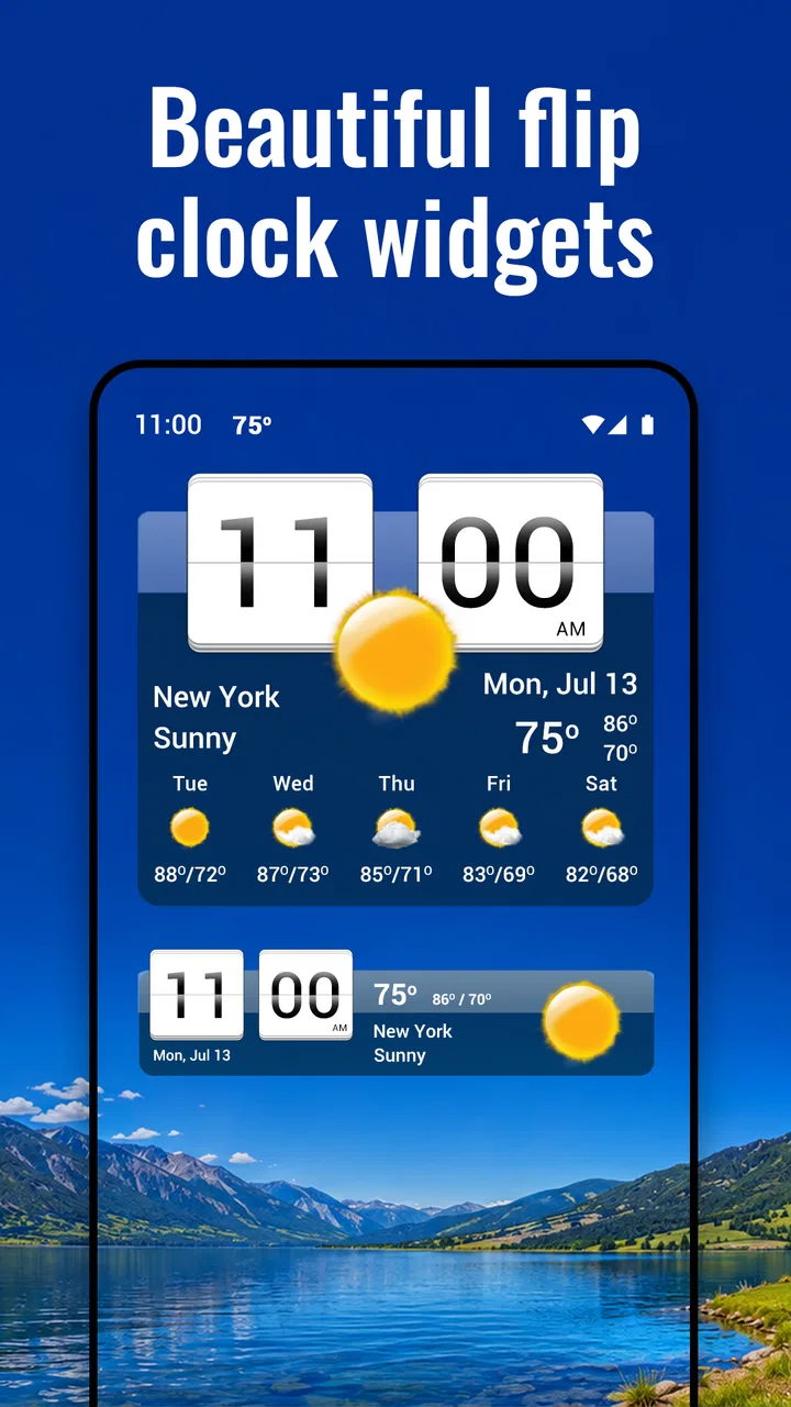
The flip-clock presentation is the part that gives this app its personality. Many weather apps are built around maps, radar layers, hourly charts, or long scrolling forecast cards. Those tools can be better when I am planning a trip or watching a storm. Here, the emphasis is more immediate: look at the display, understand the current situation, and move on.
That focus is useful in everyday situations. Before leaving for work, I can check the time and weather together instead of switching between a clock and a forecast. When I am getting ready for a walk, the temperature and conditions are more useful beside a prominent clock than buried below several news-style panels. The design also makes sense for someone who wants a widget that feels intentional rather than a tiny line of temperature text.
At the same time, I would not treat it as a replacement for every kind of weather service. If my main priority is detailed radar, severe-weather tracking, or a highly specialized forecast presentation, a dedicated weather tool may be more suitable. The strength here is the combination of glanceable weather and a distinctive clock, not an attempt to turn every weather task into a technical analysis session.
The app is free to install, with in-app purchases ranging from $4.99 to $15.99 per item. That matters when deciding how deeply to customize the experience. I can begin without paying and judge whether the clock layout, forecast style, and widget approach fit my routine before considering any optional purchase. For a first-time user, that is the sensible order: use the basic experience first, then decide whether extra flexibility is worth the cost.
Who will enjoy it most
I think it works best for people who check the weather several times a day but do not want a complicated dashboard. It is also a good match for users who enjoy a retro-inspired flip display and want their home screen to show more than an app icon. Families may appreciate the quick visual check in a shared room, while travelers can use the international forecast capability to keep another location close at hand.
It is less convincing for someone who wants the smallest possible widget, the fastest route to a radar map, or a completely minimalist weather readout with no decorative clock element. The clock is not an incidental extra; it is one of the reasons to choose this app. If that visual style feels unnecessary to you, a standard forecast app may be cleaner and more efficient.
Setting it up without getting lost
My advice is to approach the first launch in a deliberate order. Start by establishing the location you care about most, then inspect the forecast before spending time adjusting the appearance. A weather display is only useful if the place shown is correct, and a polished widget cannot compensate for a location that needs correcting.
Once the local forecast is in place, look at the main screen as a complete unit rather than focusing only on the clock. Notice where the current weather appears, how the forecast is arranged, and which details are visible without tapping. This first inspection tells you whether the app is giving you the right amount of information for a quick glance. If you immediately feel that the screen is too busy, that is a sign to simplify the presentation before adding more locations or decorative changes.
The next practical step is to place the widget where you naturally look. A weather widget hidden on a distant home-screen page defeats the purpose of a glanceable design. I prefer a position near the first screen I use in the morning, because the display becomes part of an existing habit rather than another app I must remember to open.
There is a useful distinction between using the application itself and relying on its widget. The full app is better when I want to inspect more forecast context or change settings. The widget is better for a quick answer while I am already on the home screen. Treating them as two versions of the same workflow helps avoid a common frustration: expecting the smallest widget to provide every detail available in the full interface.
For a first setup, I would keep the arrangement conservative. Choose the location, place the clock-weather display, and use it for a day before making several changes. This gives me a realistic sense of whether the information is readable at the size I selected. A layout can look attractive in a settings screen but become awkward when viewed quickly from a distance or under bright light.
Your first useful result
The first meaningful success is not installing the app or opening the forecast. It is being able to answer a real question without hesitation: “Do I need a jacket before I leave?” To reach that point, I check the current location, read the present conditions, and compare them with the nearby forecast information shown in the app. If the answer is easy to find, the setup is doing its job.
Consider a typical morning. I wake up, glance at the home screen, and see the time beside the current weather. I can decide whether to take an umbrella, change the timing of a walk, or simply dress for the conditions without opening several separate tools. Later, the same display helps me check the weather before lunch or an evening trip. This repeated, low-effort use is where the app makes more sense than a weather tool designed for occasional deep research.
For international use, I would add another location only after the local one feels comfortable. That prevents the first screen from becoming a confusing collection of places. A second location can be genuinely useful for family, work, or travel planning, but it is most helpful when I already know which part of the display represents my current surroundings and which part represents elsewhere.
One non-obvious advantage of the clock-centered layout is that it can reduce the temptation to over-check the forecast. I often do not need a long explanation of every weather variable; I need a quick decision. The app encourages that short interaction. On the other hand, this same simplicity means I should open a more detailed weather source when a decision depends on changing conditions rather than a quick snapshot.
Common points of confusion
The first likely confusion is assuming that a weather widget behaves exactly like the full application. It does not need to show every piece of information to be useful. A compact display is designed for recognition, while the larger interface is where I expect to explore more. If the widget looks sparse, I would first check its size and placement rather than concluding that the app lacks useful weather information.
Another point is visual preference. The flip-clock style is deliberately noticeable, and that can be charming or distracting depending on the home screen. Some users will enjoy the strong identity; others may prefer weather information that blends into the phone’s existing design. I would not choose this app hoping the clock element will disappear into the background, because the clock is part of its purpose.
Location handling can also affect the first impression. When the displayed place is not the one I expect, I would verify the selected location before judging the forecast layout. Weather apps often make location the foundation of the experience, and this app is no different. A correct location makes the rest of the interface immediately more understandable.
It is also worth separating forecast usefulness from forecast certainty. No weather display can remove the natural uncertainty of changing conditions. I use the app for planning ordinary activities, but I would seek a more specialized source for safety-critical decisions or rapidly developing weather. That is not a flaw unique to this product; it is a sensible boundary for any general weather app.
Finally, the free starting point should not be confused with an entirely unlimited customization experience. Optional in-app purchases are part of the app’s model, so I would explore the basic version before deciding whether I want to pay for additional options. The important question is not whether every possible adjustment is included immediately, but whether the free experience already solves my daily weather-and-time need.
Making it part of a daily routine
After the first day, I would judge the app by how little effort it requires. A successful setup should let me read the time and weather in one glance, identify the location without thinking, and decide whether I need to open the full forecast. If I still have to search through screens for the same information each morning, the widget position or presentation needs attention.
A useful workflow is to reserve the home-screen display for routine decisions and use the full application for occasional planning. For example, I can use the widget before commuting, then open the app when arranging an outdoor activity later in the day. This keeps the everyday interaction quick while preserving access to a broader view when I need more context.
I also recommend resisting the urge to add every place that might become relevant. The international forecast capability is valuable, but a display crowded with locations can make the local forecast harder to recognize. I get more from one primary location and a carefully chosen secondary location than from turning the screen into a list of destinations.
The visual design can be particularly practical on devices that spend time in a fixed location. A phone on a desk or bedside table becomes a small information panel, with the clock making the display useful even when I am not actively thinking about weather. That is a more specific use case than simply saying the app has a widget: the clock gives the screen a reason to remain useful between forecast checks.
There is a trade-off here. A display that is easy to notice may use more screen space than a compact temperature widget, and a clock-focused layout may not suit a crowded home screen. I would choose it when visibility and character matter more than maximum information density. If I want several unrelated widgets visible at once, a smaller conventional weather tool may fit better.
How it compares with ordinary weather alternatives
Compared with a standard weather app, this one feels more like a clock with weather built around it. That makes it quicker for repeated glances and more visually distinctive, while conventional forecast apps often win when I want maps, detailed timelines, or a dense set of weather measurements. Neither approach is universally better; they serve different habits.
Compared with a basic clock widget, the advantage is obvious: I get weather context without opening another tool. Compared with a minimalist temperature widget, the advantage is presentation and the broader clock-weather relationship. The cost is that the interface may feel more prominent than someone wants, especially if their goal is only to see a number.
Compared with a travel-oriented weather service, the international location support is helpful but does not automatically make this a complete trip-planning solution. I would use it to keep an eye on another place, then turn to a more specialized service if the trip depends on detailed alerts, maps, or long-range planning. This distinction helps prevent disappointment and makes the app easier to evaluate fairly.
The rating of 4.2 and its large install base make it a credible option to try, but I would pay more attention to the fit between the design and my routine than to popularity alone. Weather preferences are personal. Some people want a quiet utility; others want a display they enjoy seeing throughout the day. This app clearly leans toward the second group.
My recommendation after regular use
I recommend giving it a trial if you want a free weather app that also turns the home screen into a readable clock display. The first setup is straightforward when handled in stages: establish the main location, place the widget, test the readability, and only then explore additional locations or optional customization. That path gets a new user to a useful result without making the first session feel like a design project.
I would skip it if you dislike prominent clock widgets, need professional-level weather analysis, or want the smallest possible amount of information on screen. In those cases, a conventional weather app or a dedicated forecast service will probably feel more direct. The same is true if you never use widgets and prefer opening a simple forecast list only when necessary.
For me, the best part is the small everyday improvement: time and weather become one glance instead of two separate checks. The app does not need to replace every forecast tool to be worthwhile. It succeeds when I want a dependable-looking, visually distinct home-screen reference for ordinary decisions, while still leaving room to use another service when conditions demand deeper attention.
As a free weather app with optional purchases, Everyone content guidance, and support for older Android devices beginning with version 6.0, it is easy to test without committing immediately. MACHAPP Software Ltd has kept the concept focused for years, and the current 9.01.0 release continues that clock-first identity. If your ideal weather app is something you can understand before your first sip of coffee, this is a strong candidate.
FAQs for Sense Flip Clock & Weather
01What features does Sense Flip Clock & Weather offer?
Sense Flip Clock & Weather provides a sleek and customizable clock and weather widget for your home screen. It offers detailed weather forecasts, including temperature, humidity, and wind speed. Users can choose from different skins and themes, making it highly adaptable to personal preferences. It also supports world clock functionality and provides accurate weather alerts.
02Is Sense Flip Clock & Weather free to use?
Yes, Sense Flip Clock & Weather is available for free download on both Android and iOS platforms. However, the app offers in-app purchases that unlock additional features and customization options. These premium features may include more detailed forecasts, enhanced graphics, and ad-free usage, which can enhance the overall user experience.
03How accurate is the weather information provided by the app?
Sense Flip Clock & Weather leverages reliable data sources to ensure accurate weather information. The app regularly updates its forecasts to reflect changes in weather conditions, offering users up-to-date and precise information. However, accuracy can vary depending on your location and the data sources used, so it's always good to cross-check with local weather updates.
04Can I customize the appearance of the widget?
Absolutely! Sense Flip Clock & Weather is known for its extensive customization options. Users can select from various skins, themes, and color schemes to match their home screen aesthetics. The app allows you to adjust the widget size, style, and information displayed, ensuring a personalized experience tailored to individual preferences.
05Does Sense Flip Clock & Weather consume a lot of battery?
Sense Flip Clock & Weather is designed to be efficient in terms of battery consumption. While it continuously updates weather information and displays real-time data, it optimizes performance to minimize battery drain. Users can adjust update intervals in the settings to further manage battery usage, ensuring the app runs smoothly without significantly impacting device performance.
Pros
- Accurate weather forecasts
- Customizable widget appearance
- Smooth app performance
- Real-time weather alerts
- Minimal battery usage
Cons
- Ads can be intrusive
- Limited free features
- Occasional location errors
- Widget resizing issues
- No offline functionality

Sense Flip Clock & Weather
Gallery